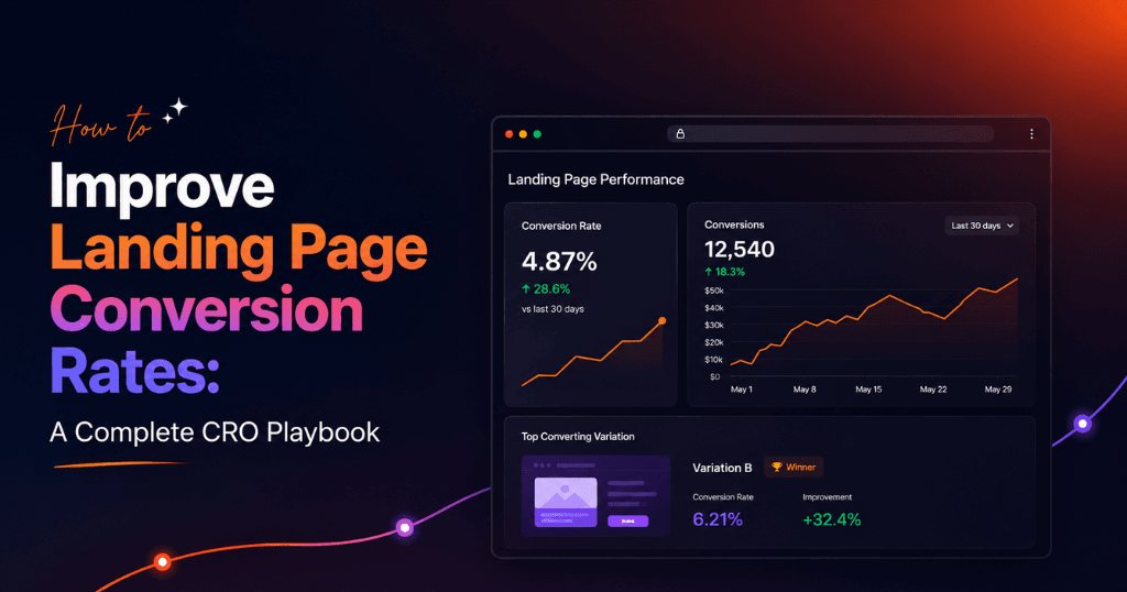
The fastest way to improve landing page conversion rates is to align every element on the page — headline, copy, design, and CTA — with the exact intent of the traffic arriving on it, then systematically test changes until the data tells you what works. A landing page that converts at 2% and receives 1,000 visitors per month generates 20 leads; the same page at 6% generates 60 leads — from the same ad spend, same audience, same traffic volume.
This guide covers every dimension of landing page conversion rate optimization (CRO): the psychology behind conversion decisions, the structural elements that win or lose the visitor in the first five seconds, the testing methodology that produces reliable results, and the specific tactics that consistently move conversion rates upward. Whether you’re managing landing pages in-house or partnering with a performance marketing agency in Chennai, this is the complete playbook.
Why Landing Page Conversion Rate Is the Most Leveraged Metric in Paid Marketing
Most performance marketing teams spend the majority of their optimization time on targeting and bidding — and comparatively little time on what happens after the click. This is a misallocation of effort.
Consider the math: according to WordStream’s 2024 industry benchmark report, the average landing page conversion rate across all industries is 2.35%. The top 25% of advertisers convert at 5.31% or higher. The top 10% convert at 11.45% or above. The difference between the average and the top 10% is not better targeting — it’s better landing pages.
The financial implication is stark:
- At ₹100 CPC with 1,000 monthly visitors: a 2% conversion rate yields 20 leads at ₹5,000 per lead
- Same traffic at 6% conversion rate: yields 60 leads at ₹1,667 per lead — a 66% reduction in cost per lead with zero increase in ad spend
According to Unbounce’s 2024 Conversion Benchmark Report, dedicated landing pages convert 65% better than sending paid traffic to a website homepage. Despite this, a significant portion of PPC campaigns in India still direct ad traffic to homepages or generic service pages — leaving conversion potential on the table.
A Forrester Research study found that every $1 invested in CRO returns an average of $100 — a 9,900% ROI. No targeting optimization, bid adjustment, or audience expansion comes close to this return potential.
This is why every PPC agency in Chennai that manages campaigns at a professional level treats landing page optimization as a core service, not an optional add-on.
The 5-Second Rule: What Visitors Decide Before Reading Anything
Visitors to a landing page make a stay-or-leave decision in approximately 50 milliseconds, according to research published in the journal Behaviour & Information Technology. That first impression is based entirely on visual design and layout — before a single word has been read.
This means the visual design of your landing page is conversion-critical, not just aesthetic. The questions a visitor answers subconsciously in those 50 milliseconds:
- Does this page look professional and trustworthy?
- Does it appear relevant to what I was promised in the ad?
- Does it load fast enough to be worth my time?
If the answer to any of these is “no,” the visitor leaves — and your ad spend is wasted.
What the 5-second test reveals about your landing page:
Use tools like UsabilityHub’s Five Second Test or Hotjar to run timed exposure tests where participants view your landing page for exactly 5 seconds, then answer questions like:
- What does this page offer?
- Who is it for?
- What should I do next?
If test participants can’t answer all three correctly, your above-the-fold design is failing — and so is your conversion rate.
Element 1: The Headline — Where Conversion Is Won or Lost
The headline is the most important element on any landing page. According to David Ogilvy’s foundational research in Confessions of an Advertising Man, 80% of people read the headline and only 20% read the rest of the copy. In the digital context, this means your headline carries the conversion weight of the entire page.
What a High-Converting Landing Page Headline Does
A headline that converts does four things simultaneously:
- Confirms relevance — the visitor knows immediately they’re in the right place
- States the primary benefit — what they get, not what you do
- Speaks to a specific audience — it resonates with one type of person, not everyone
- Creates forward momentum — makes them want to read what comes next
Message Match: The Most Critical Headline Principle
Message match is the alignment between the language used in your ad and the language used on your landing page. When a visitor clicks an ad that says “Free PPC Audit for Chennai Businesses” and arrives at a headline that says “Welcome to Our Digital Marketing Services,” the disconnect registers as a broken promise — and most visitors bounce.
According to Unbounce, improving message match alone increases conversion rates by an average of 212%. It’s the single highest-impact, lowest-effort improvement available for most landing pages.
Message match formula: If your ad headline is: “Grow Your ROAS with Expert PPC Management” Your landing page headline should be: “Expert PPC Management That Grows Your ROAS — Starting This Month”
The vocabulary, the promise, and the implied offer must align — word for word if possible.
High-Converting Headline Formulas
| Formula | Structure | Example |
|---|---|---|
| Outcome + Timeframe | Get [result] in [time period] | “Double Your Leads in 60 Days or We Work Free” |
| Specific Benefit + Audience | [Benefit] for [specific audience] | “PPC Management Built for Chennai E-Commerce Brands” |
| Problem + Solution | Stop [pain] with [solution] | “Stop Wasting Ad Spend — Get a Free Campaign Audit” |
| Number + Result | [Number]-proven [outcome] | “The 7-Step System That Reduces Cost Per Lead by 40%” |
| Question + Implied Answer | [Question that implies the answer] | “What If Your Google Ads Generated 3x More Leads?” |
| Social Proof + Offer | Trusted by [N] + [CTA] | “Trusted by 500+ Indian Brands — Get a Free Strategy Call” |
Headline testing priority: Before testing anything else on your landing page, test headlines. Headline variations consistently produce the largest conversion rate swings of any single element — routinely 20–50% differences between variants.
Element 2: The Hero Section — Above the Fold Conversion Architecture
The “hero section” is everything visible on a landing page before the visitor scrolls. It is the most conversion-critical real estate on the page — and it must accomplish three things: confirm relevance, communicate value, and present the primary CTA.The 4 Components of a High-Converting Hero Section
- Headline (Primary Value Proposition) Already covered above — your most important conversion element.
- Subheadline (Expanding on the Promise) The subheadline expands on the headline’s promise, adds specificity, and bridges to the CTA. It should answer: “How does this work / who is this for / what happens next?”
- Hero Image or Video The hero visual should show the outcome — not the process. For a service business, this means showing the transformation: happy clients, results dashboards, before-and-after data. For a product business, it means showing the product in the context of the desired lifestyle outcome.
- Primary CTA (Call to Action) The primary CTA appears in the hero section and must be:
- Above the fold: visible without scrolling on 90%+ of devices
- High contrast: visually distinct from the surrounding design
- Action-oriented: starts with a verb (“Get,” “Start,” “Claim,” “Book”)
- Benefit-framed: tells the visitor what they receive, not what they’re doing
| Weak CTA | Strong CTA |
|---|---|
| “Submit” | “Get My Free PPC Audit” |
| “Click Here” | “Claim Your 30-Minute Strategy Call” |
| “Contact Us” | “Book a Free Campaign Review” |
| “Learn More” | “See How We Reduced CPL by 40%” |
| “Sign Up” | “Start My Free 14-Day Trial” |
Element 3: Landing Page Copy — Writing That Converts
Landing page copy has one job: move the visitor from interest to action. It accomplishes this by addressing the buyer’s psychology — their desires, their fears, their objections, and their questions — in a sequence that builds toward the CTA.
The PAS Copywriting Framework for Landing Pages
PAS (Problem → Agitate → Solution) is the most reliable copywriting structure for landing page body copy:
Problem: Name the specific pain or challenge the visitor is experiencing
“Most businesses running Google Ads in India are wasting 40–60% of their budget on clicks that never convert.”
Agitate: Deepen the emotional weight of that problem — make it feel urgent
“Every day your campaigns run without expert optimization, you’re paying for irrelevant traffic, missing high-intent searches, and letting competitors capture customers who should be yours.”
Solution: Present your offering as the clear, logical resolution
“Weboin’s PPC management team audits your existing campaigns, identifies the exact sources of wasted spend, and rebuilds your account architecture for maximum conversion efficiency — in the first 30 days.”
Feature → Benefit Translation
Landing page copy that lists features converts at a fraction of the rate of copy that translates those features into outcomes. Every feature claim must be rewritten as a benefit statement.
| Feature (Weak) | Benefit Translation (Strong) |
|---|---|
| “We use AI-powered bid optimization” | “Your bids adjust automatically to win high-value clicks and skip expensive irrelevant ones — 24/7” |
| “Dedicated account manager” | “One expert who knows your business inside out — always reachable, never a generic support ticket” |
| “Weekly reports” | “See exactly where every rupee went and what it generated — every Monday morning” |
| “A/B testing capability” | “We find what your specific audience responds to, so you stop guessing and start scaling” |
| “15 years of industry experience” | “Your campaigns are built on patterns from thousands of tested campaigns — not trial and error” |
Handling Objections in Copy
Every visitor who doesn’t convert has an unresolved objection. The highest-converting landing pages identify the most common objections and address them proactively in the copy.
Common landing page objections and how to handle them:
- “This is too expensive” → Address with ROI framing: “Our clients average ₹4 returned for every ₹1 spent on management fees”
- “I don’t know if this will work for my business” → Address with specificity: “We’ve delivered results for [specific industries] including [named examples]”
- “I’m locked into a long contract” → Address directly: “No lock-in. Cancel anytime. Our results keep you — not our contracts.”
- “I don’t have time for this” → Address with process clarity: “Onboarding takes 2 hours. After that, we handle everything.”
- “I’ve been burned before” → Address with proof: “93% of our clients renew after their first 3 months. Here’s why.”
Element 4: Social Proof — The Conversion Multiplier
Social proof is the most powerful conversion lever available on a landing page — because it transfers the trust your past customers have earned to your future customers. According to Nielsen, 92% of people trust recommendations from other people — even strangers — more than brand communications.
The 6 Types of Social Proof and Where to Place Them
| Social Proof Type | Conversion Impact | Optimal Placement |
|---|---|---|
| Testimonials with specific results | Very High | Below hero, near CTA |
| Client logos (recognized brands) | High | Hero section or immediately below |
| Star ratings and review counts | High | Hero section, near CTA |
| Case studies with data | Very High | Mid-page, before secondary CTA |
| Video testimonials | Highest | Mid-page |
| Third-party review badges | High | Near CTA (Clutch, G2, Google) |
| Press / media mentions | Medium-High | Below hero |
| Customer counts | Medium | Hero section |
What Makes a Testimonial Convert
Not all testimonials are equal. Generic praise (“Great service! Highly recommend!”) adds little conversion value. Specific, results-oriented testimonials are conversion assets.
Weak testimonial:
“Weboin is a fantastic agency. The team is very professional and responsive.”
Strong testimonial:
“Before Weboin, we were spending ₹2L/month on Google Ads and getting 15 leads. Within 60 days of them taking over, we were getting 47 leads on the same budget. Our cost per lead dropped from ₹13,333 to ₹4,255. We’ve now scaled to ₹5L/month with confidence.” — Ramesh K., Founder, Chennai-based real estate developer
The strong testimonial contains: specific numbers before and after, a timeframe, the outcome in the client’s own words, and attribution to a real, named person.
How to elicit strong testimonials: Ask specific questions rather than “Can you give us a testimonial?”:
- “What specific result have you seen since working with us?”
- “What was your situation before, and what is it now?”
- “What would you tell someone who’s considering working with us?”
Element 5: Page Speed — The Invisible Conversion Killer
Page speed is the conversion factor most advertisers know is important and fewest have actually fixed. According to Google’s own data:
- 53% of mobile users abandon a page that takes longer than 3 seconds to load
- A 1-second delay in page load time reduces conversions by 7% (Aberdeen Group research)
- Pages meeting Core Web Vitals thresholds are 24% less likely to be abandoned before loading
For a digital marketing company in Chennai running paid campaigns, page speed is not a technical concern — it’s a revenue concern. A landing page that loads in 5 seconds instead of 2 seconds can cost 20–30% of potential conversions before the visitor ever sees the headline.
Core Web Vitals: The Speed Metrics That Matter
| Metric | What It Measures | Good Threshold | Poor Threshold |
|---|---|---|---|
| LCP (Largest Contentful Paint) | How fast the main content loads | Under 2.5s | Over 4.0s |
| INP (Interaction to Next Paint) | How fast the page responds to input | Under 200ms | Over 500ms |
| CLS (Cumulative Layout Shift) | Visual stability during load | Under 0.1 | Over 0.25 |
How to diagnose and fix speed issues:
- Run Google PageSpeed Insights on your landing page URL — it scores both mobile and desktop performance and provides specific, prioritized recommendations
- Compress images: Use WebP format and compress to under 100KB per image without visible quality loss. Tools: Squoosh, TinyPNG, Cloudflare Image Optimization
- Eliminate render-blocking resources: JavaScript and CSS files that load before the main content should be deferred or async-loaded
- Use a CDN (Content Delivery Network): Cloudflare, Amazon CloudFront, or Fastly deliver assets from servers geographically close to the user
- Minimize redirects: Each redirect adds 100–300ms of load time. Landing pages should have zero redirects from the ad destination URL
- Lazy-load below-fold images: Images below the fold don’t need to load until the user scrolls to them
Element 6: Form Design — The Final Friction Point
The lead capture form is the last step between a visitor and a conversion. At this stage, the visitor has read your copy, found your offer compelling, and decided to act — but a poorly designed form can still lose them.
Form Design Principles That Maximize Completions
Field count: Every additional form field reduces conversion rate. A 2022 HubSpot study found that reducing form fields from 11 to 4 increased conversions by 120%. The rule: ask for only what you absolutely need to initiate a business conversation.
- For a consultation booking: Name + Phone or Email is sufficient
- For a lead gen offer download: Email only
- For a detailed quote request: Name + Email + Company + Brief description of need (maximum 4 fields)
Field labels: Use inline labels or floating labels that remain visible when the field is active. Placeholder text that disappears when typing increases error rates and frustrates users.
CTA button on the form: The submit button is not a submit button — it’s a CTA. Apply the same principles as your primary CTA:
- First-person framing: “Send My Free Audit Request” not “Submit”
- Benefit-framed: “Get My Free Strategy Call” not “Click Here”
- Action verb: starts with “Get,” “Send,” “Claim,” “Book,” “Start”
Trust signals adjacent to the form: Place these elements immediately near the form submission button:
- Privacy assurance: “We never share your information. No spam, ever.”
- Response time commitment: “We respond within 2 business hours”
- Social proof: “Join 500+ businesses who’ve taken this step”
- Security badge if collecting payment information
Mobile form optimization: With 60–70% of landing page traffic arriving on mobile, mobile form experience is critical:
- Input fields large enough to tap without zooming (minimum 44px tap targets)
- Appropriate keyboard type triggered for each field (numeric for phone, email for email address)
- Autofill enabled for common fields (name, email, phone)
- Form visible without horizontal scrolling at all mobile viewport sizes
Element 7: The CTA Strategy — Positioning, Copy, and Color
The CTA button is the conversion trigger — the precise moment where intent becomes action. Most landing pages have a single CTA; high-converting landing pages place CTAs strategically throughout the page, with consistent offer framing.
CTA Placement Strategy
Above the fold: Primary CTA immediately visible on arrival — for visitors who are ready to act without scrolling After social proof: Secondary CTA following testimonials or case studies — for visitors who needed validation before acting After objection handling: CTA following the FAQ or objection-handling section — for visitors who needed reassurance Page footer: Final CTA for visitors who scrolled to the bottom — the most committed group of non-converters
Research by Crazy Egg found that landing pages with 3 strategically placed CTAs convert at 1.5–2x the rate of pages with a single CTA — because different visitors reach their decision point at different points on the page.
CTA Button Design
Color: The CTA button must have sufficient contrast against the surrounding background to be immediately visually distinct. There is no universally “best” CTA color — the best color is whichever creates the highest contrast within your specific design. Orange and green are frequently cited as high-performers, but the contrast principle supersedes color preference.
Size: CTA buttons should be large enough to be immediately noticeable and easy to tap on mobile (minimum 44px height, ideally 50–60px). Buttons that are too small are missed; buttons that are too large look aggressive.
Shape: Rounded corners (8–12px radius) on CTA buttons consistently outperform sharp corners in A/B tests — likely because rounded shapes are perceived as less threatening and more approachable.
Whitespace: Surround the CTA button with sufficient whitespace so it visually “breathes” and is easy to focus on. CTA buttons buried in cluttered layouts are missed.
Element 8: A/B Testing — The System That Compounds Conversion Gains
Individual CRO tactics improve conversion rates in isolation. A systematic A/B testing program compounds those improvements over time — each winning test becomes the new baseline for the next test. After 12 months of consistent testing, a landing page that started at 2% conversion might be converting at 8–12%.
The A/B Testing Framework for Landing Pages
Step 1: Prioritize using the PIE framework Before testing, prioritize which elements to test using PIE scoring:
- Potential: How much improvement could this change realistically deliver?
- Importance: How many visitors/conversions does this element affect?
- Ease: How technically difficult is this change to implement?
Score each potential test 1–10 on each dimension. Test the highest-PIE items first.
Step 2: Form a clear hypothesis
“We believe that changing the CTA from ‘Contact Us’ to ‘Book My Free Strategy Call’ will increase conversion rate by 15–25% because the specific, benefit-framed CTA communicates clearer value than the generic contact framing.”
Step 3: Calculate required sample size Use an A/B test significance calculator (Optimizely, VWO, or AB Testguide) to determine the minimum number of conversions per variant needed for statistical significance at 95% confidence. Running tests without sufficient sample sizes produces unreliable results.
Step 4: Run the test without interference Resist the temptation to end tests early when one variant appears to be winning. Early data is frequently misleading. Run until statistical significance is confirmed or the pre-determined sample size is reached.
Step 5: Document and apply learnings Maintain a testing log with: what was tested, hypothesis, results, statistical confidence, and what this tells you about your audience. This log becomes an invaluable asset over time.
What to Test (Priority Order)
| Test Priority | Element | Expected Conversion Impact |
|---|---|---|
| 1 (Highest) | Headline / value proposition | 20–50% |
| 2 | CTA copy and design | 10–30% |
| 3 | Hero image / video | 10–25% |
| 4 | Offer structure | 15–40% |
| 5 | Form field count | 10–120% |
| 6 | Social proof type and placement | 5–20% |
| 7 | Page length (short vs. long) | 5–25% |
| 8 | Trust signals and badges | 5–15% |
A/B testing tools:
- Google Optimize successor / VWO: Full A/B testing with heatmaps and session recordings
- Optimizely: Enterprise-level testing with sophisticated targeting
- Unbounce: Landing page builder with built-in A/B testing
- HotJar: Heatmaps, session recordings, and form analytics for qualitative insights
- Crazy Egg: Click maps and scroll maps to understand visitor behavior
Element 9: Mobile Optimization — Converting the Majority of Your Traffic
Mobile devices account for 60–70% of all paid search traffic in India (Google India data, 2024). Yet most landing pages are still designed desktop-first, with mobile optimization treated as an afterthought. The result is that the majority of a campaign’s traffic arrives to a suboptimal experience.
Mobile Landing Page Conversion Principles
Thumb-friendly design: The interactive elements of a mobile landing page — buttons, form fields, navigation links — must be reachable and tappable by a thumb holding a phone in one hand. Elements in the upper corners of the screen are the hardest to reach; place CTAs in the lower center or lower right where thumbs naturally rest.
Vertical content flow: Mobile pages scroll vertically. Design the content to tell a complete, compelling story in a single-column layout from top to bottom — with each section leading naturally to the next.
Condensed above-fold: On mobile, “above the fold” is much smaller than on desktop. The hero headline, subheadline, and CTA must all be visible without scrolling on a standard phone screen (375px wide, 667px tall). Test your landing page in Google’s Mobile-Friendly Test and on actual devices.
Click-to-call for high-intent traffic: For service businesses, adding a click-to-call button to mobile landing pages consistently increases total conversions. Many mobile visitors prefer to call rather than complete a form — give them that option.
Load speed on mobile networks: Mobile users are often on 4G rather than WiFi. Test your landing page load time on simulated 4G in Google PageSpeed Insights. If it takes more than 3 seconds, you’re losing the majority of mobile visitors before they see your content.
How Weboin Optimizes Landing Pages for Performance Clients
At Weboin, a specialist digital marketing agency in Chennai, landing page optimization is integrated into every paid media engagement. We treat landing pages as the conversion layer of every campaign — the place where ad spend is either maximized or wasted.
Our Landing Page CRO Process:
Phase 1 — Conversion Audit We audit every active landing page against a 40-point checklist covering message match, hero section architecture, copy quality, social proof effectiveness, form design, page speed, and mobile experience. Every audit produces a prioritized list of improvements ranked by expected conversion impact.
Phase 2 — Qualitative Research We install Hotjar or Microsoft Clarity on landing pages to capture heatmaps, session recordings, and form analytics. This tells us where visitors are clicking, where they’re stopping, where they’re rage-clicking in frustration, and where they’re abandoning forms. Quantitative data tells us what is happening; qualitative tools tell us why.
Phase 3 — Hypothesis Development and Prioritization Based on audit findings and qualitative data, we build a testing roadmap using PIE scoring. We typically identify 8–12 testable hypotheses per landing page and prioritize by expected impact.
Phase 4 — Implementation and Testing We implement changes using Unbounce, VWO, or direct code implementation depending on the client’s setup. Tests run until statistical significance is confirmed at 95% confidence.
Phase 5 — Scale and Iteration Winners become the new baseline. The testing cycle continues — each iteration producing a higher-converting page than the one before.
Typical results for clients who commit to a structured CRO program with Weboin:
- 30–80% conversion rate improvement within 90 days
- Reduction in cost per lead of 25–50% from the same ad budget
- Improved Quality Score on Google Ads (better landing page experience = lower CPCs)
As a full-service digital marketing company in Chennai, Weboin ensures that every rupee of ad spend lands on a page built to convert — not just designed to look good.
Landing Page Mistakes That Destroy Conversion Rates
Recognizing these patterns is the fastest path to improvement. Most underperforming landing pages share the same set of errors.
Mistake 1: Sending Paid Traffic to the Homepage Homepages serve multiple audiences with multiple objectives. Landing pages serve one audience with one objective. According to Unbounce, dedicated landing pages convert 65% better than homepages for paid traffic. Never use a homepage as an ad destination.
Mistake 2: Message Mismatch Between Ad and Landing Page The language of the ad and the language of the landing page must align precisely. A visitor who clicked “Free Google Ads Audit” and arrives at “Comprehensive Digital Marketing Solutions” feels misled and bounces.
Mistake 3: Multiple CTAs Competing for Attention A landing page with five different CTA options (“Download,” “Contact Us,” “See Pricing,” “Watch Demo,” “Learn More”) creates decision paralysis. One primary CTA per page. Hick’s Law (the more options, the longer the decision takes) is not suspended for landing pages.
Mistake 4: No Social Proof A landing page that asks for contact information without providing evidence that others have trusted you and benefited is asking visitors to take a risk on an unknown quantity. Social proof reduces perceived risk — and reduced risk increases conversion.
Mistake 5: Form Fields That Ask for Too Much Too Soon Asking for company size, annual revenue, number of employees, and budget before establishing any trust is a high-friction approach that suppresses lead volume. Progressive profiling — asking for more information over multiple interactions — is more effective than front-loading a long form.
Mistake 6: Ignoring Mobile Experience Designing for desktop and hoping it works on mobile is a conversion strategy for 2012, not 2025. With 60–70% of traffic arriving on mobile, mobile-first landing page design is a prerequisite, not an enhancement.
Mistake 7: Testing Without Statistical Rigor Ending A/B tests early, testing multiple variables simultaneously, or drawing conclusions from insufficient sample sizes produces misleading data that leads to wrong decisions. CRO without statistical rigor is not optimization — it’s randomness with extra steps.
Landing Page CRO Checklist: 40-Point Audit
Use this checklist to evaluate any landing page before publishing or before beginning an optimization program:
Above the Fold / Hero Section
- [ ] Headline is benefit-focused and speaks to a specific audience
- [ ] Message matches the ad that drives traffic to this page
- [ ] Subheadline expands on headline with specificity
- [ ] Primary CTA is above the fold and visually distinct
- [ ] CTA copy is action-oriented and benefit-framed
- [ ] Hero image shows outcome, not process
- [ ] Page loads in under 2.5 seconds on mobile
Copy
- [ ] Copy leads with benefits, not features
- [ ] Primary objections are addressed proactively
- [ ] Copy is written in second person (“you,” “your”)
- [ ] No industry jargon the audience wouldn’t use
- [ ] Copy supports — doesn’t repeat — what the visual communicates
Social Proof
- [ ] At least one testimonial with specific results and attribution
- [ ] Client logos (if applicable) visible without excessive scrolling
- [ ] Review count and star rating displayed
- [ ] Case study or data point demonstrating results
Form
- [ ] Form fields limited to what’s absolutely necessary
- [ ] Form CTA button is benefit-framed (not “Submit”)
- [ ] Privacy assurance placed near submit button
- [ ] Mobile form tested on real devices
- [ ] Thank-you page confirms next steps clearly
Technical
- [ ] Page passes Core Web Vitals (LCP < 2.5s, CLS < 0.1)
- [ ] HTTPS enabled
- [ ] Mobile-first design tested at 375px viewport
- [ ] No broken links or images
- [ ] Conversion tracking verified in GA4 and ad platform
- [ ] UTM parameters tracked for traffic attribution
Frequently Asked Questions About Landing Page Conversion Rate Optimization
The industry average across all sectors is 2.35%, with top performers converting at 5.31%+. The top 10% of landing pages convert at 11.45% or above. "Good" is relative to your industry and offer type — lead generation pages for free offers typically convert higher than pages selling high-ticket services. Focus on improving your own baseline rather than benchmarking against industry averages.
Quick wins from headline and CTA changes can be implemented and tested within 2–4 weeks. More comprehensive optimization programs that work through multiple testing cycles typically show significant conversion improvement within 60–90 days.
Yes — for best results, create a dedicated landing page for each distinct campaign, audience segment, or offer. Message match between ad and landing page is one of the highest-impact conversion factors available, and it requires page-level specificity.
You need enough conversions per variant to reach statistical significance — typically a minimum of 100 conversions per variant at 95% confidence. If your current conversion rate is 2%, you need 5,000 visitors per variant for reliable results. At lower traffic volumes, use directional data rather than treating results as conclusive.
A landing page is a single-purpose page designed to convert a specific type of traffic (from a specific ad, email, or campaign) into a specific action. It typically has no navigation menu (to eliminate exit points), one primary CTA, and copy tailored to the specific source of traffic. A website page serves multiple audiences and objectives simultaneously.
Absolutely. A specialist performance marketing agency in Chennai like Weboin integrates landing page optimization into every paid campaign — because ad spend and landing page performance are inseparable. Sending well-targeted, well-crafted ad traffic to a poor landing page is one of the most expensive mistakes in digital marketing.
Final Thought: The Landing Page Is Where Ad Spend Becomes Revenue
Every paid click is an investment. The landing page is where that investment either generates a return or produces a loss. Treating landing page optimization as a lower priority than targeting and bidding is, mathematically, a strategic error.
The brands that consistently achieve the strongest performance marketing results are those that treat the landing page as an equal partner to the ad — investing in copy, design, speed, testing, and iteration with the same rigor they apply to their media buying.
A landing page that converts at 6% instead of 2% doesn’t just triple your leads — it changes the economics of your entire marketing operation. Your cost per lead drops. Your budget goes further. You can outbid competitors who convert poorly while maintaining the same or better ROI. The compounding effect of sustained CRO work builds a structural advantage that’s genuinely difficult to reverse-engineer.
Whether you’re optimizing landing pages yourself or partnering with a specialist PPC agency in Chennai like Weboin, the framework in this guide gives you everything you need to close the gap between what your landing pages are delivering and what they’re capable of.
About Weboin: Weboin is a full-service performance marketing agency in Chennai offering PPC management, landing page optimization, SEO, social media strategy, and conversion rate optimization. As a trusted digital marketing agency in Chennai, Weboin helps businesses across industries build landing pages that convert paid traffic into qualified leads and measurable revenue — through data-driven testing and proven CRO methodology.

No comment yet, add your voice below!