
Building a consistent brand identity means creating and documenting a deliberate, repeatable system — visual, verbal, and behavioral — that makes your brand immediately recognizable across every touchpoint, from your Instagram profile to your email footer to how your team answers the phone. Consistency is not about rigidity; it’s about giving your audience a reliable experience that accumulates into recognition, trust, and preference over time.
This guide covers the complete architecture of brand identity consistency: what it includes, why the data makes it a commercial priority, and exactly how to build it — layer by layer — so that every customer interaction reinforces the same brand impression. Whether you build your brand in-house or work with a digital marketing agency in Chennai, this framework gives you a system that scales.
Why Brand Identity Consistency Is a Financial Decision, Not a Creative Preference
The case for brand identity consistency is sometimes framed as a design concern — logos should match, colors should be consistent. But the commercial evidence makes a stronger argument: consistency is one of the highest-ROI investments in a business’s marketing infrastructure.
The data is unambiguous:
- Lucidpress research involving 200+ brand managers and marketers found that consistent brand presentation increases revenue by an average of 23% — measured across companies of all sizes and industries
- According to Edelman’s 2024 Trust Barometer, 81% of consumers cite trust as a deciding factor in purchase decisions, and consistency is one of the primary mechanisms through which trust is built — because consistent brands are perceived as reliable
- McKinsey’s brand research found that companies with strong, consistently applied brand identities outperform their peers in total shareholder return by 73% over a 10-year period — a finding that held across categories
- A Nielsen study found that 59% of consumers prefer to buy from brands they recognize — and recognition is almost entirely a function of consistent visual and verbal identity repeated over time
- HubSpot’s research found that color consistency alone increases brand recognition by 80% — which explains why Tiffany Blue, Hermès Orange, and Coca-Cola Red are commercially valuable assets in their own right
The implication is direct: every time your brand appears inconsistently — different colors on different platforms, different tone in different communications, different logo treatments in different documents — it erodes the recognition and trust that would otherwise compound into commercial advantage.
For businesses working with a digital marketing company in Chennai, brand consistency should be treated as infrastructure — not a creative project to be completed once and forgotten, but a living system that requires governance, documentation, and ongoing management.
The 5-Layer Brand Identity System
A consistent brand identity is not just a logo and a color palette. It’s a five-layer system where each layer builds on the previous one — and where weakness in any layer creates inconsistency that erodes the whole.
| Design Mistake | Why It Hurts Performance | Solution |
|---|---|---|
| Too much text in the frame | Cluttered visuals trigger “this is an ad” recognition and scroll | Limit to one key phrase or stat as text overlay |
| Logo placement as the first element | Logos activate “ad filter” — viewers skip before reading | Lead with hook visual; add logo in final seconds for video |
| Low-contrast text on busy backgrounds | Unreadable text is unread copy | Use solid color bars or text shadow for overlay readability |
| Inconsistent brand colors across variants | Visual inconsistency reduces cumulative recognition | Define a narrow color palette for all ad creative |
| Landscape format for mobile-first platforms | Letterboxed content loses 50%+ of screen real estate | Default to 9:16 for Meta/Instagram/TikTok; 1:1 for feed |
| Stock photography with generic people | Generic visuals reduce trust and distinctiveness | Use real team, client, or product photography |
| Headline too long for mobile reading | Long headlines are scanned, not read | Target 5–7 words for maximum mobile headline impact |
Most brands invest heavily in Layer 2 (visual identity) and give minimal attention to Layers 3, 4, and 5. This produces a brand that looks the same in a logo but sounds completely different in a customer email versus a social media post — an inconsistency that audiences detect subconsciously and translate into reduced trust.
Layer 1: The Brand Strategy Foundation
Visual and verbal consistency without strategic alignment is cosmetic. A brand can have a beautiful, consistent design system and still be deeply inconsistent in what it stands for — which produces a different and more damaging form of brand failure.
Before any design work begins, three strategic questions must have documented, specific answers:
Question 1: What Is the Brand’s Core Purpose?
Not the mission statement (which is often a description of activities) — but the why. The reason the brand exists that isn’t “to generate revenue.”
A concrete purpose shapes brand identity decisions in ways that are difficult to articulate but immediately obvious in their absence. Apple’s purpose (“to challenge the status quo and think differently”) produces coherent design choices. A brand whose purpose is vague produces incoherent ones.
How to define purpose: Ask: “If our brand disappeared tomorrow, what would the world genuinely lose?” The honest answer to this question — stripped of marketing language — is closer to your real purpose than most mission statements.
Question 2: Who Is the Brand For?
Not demographically — but psychographically. What does this audience believe, fear, aspire to, and value? What is the world they’re trying to create for themselves, and how does the brand fit into that world?
A brand identity that attempts to appeal to everyone produces creative that resonates with no one. The most commercially successful brand identities are built for a specific type of person — and the specificity of that targeting is what makes the resulting identity feel relevant and alive to that audience.
Question 3: What Is the Brand’s Positioning?
Positioning is the specific space the brand occupies in the mind of the target audience — relative to competitors. It answers: “For [specific audience], [brand name] is the [category] that [specific differentiation], because [reason to believe].”
Positioning creates the strategic context that makes design and voice decisions clear. A brand positioned as “the most accessible version of a premium category” makes completely different design choices than a brand positioned as “the most uncompromising quality in the category” — even if both serve similar audiences.
Layer 2: Visual Identity System
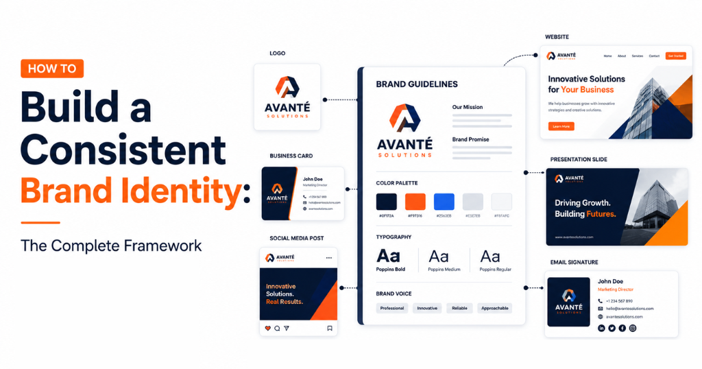
The visual identity is the most immediately recognizable layer of brand consistency — and the one that most businesses get partially right and partially wrong. A complete visual identity system extends far beyond the logo.
The 6 Components of a Complete Visual Identity System
- Logo System A complete logo system includes:
- Primary logo: Full version for high-prominence applications
- Secondary logo: Simplified version for medium-prominence applications (headers, business cards)
- Icon/mark: Symbol-only version for small-scale applications (app icons, favicons, social profile pictures)
- Clear space rules: Minimum padding requirements that ensure the logo is never visually crowded
- Color variants: Full-color, reversed (white on dark), and single-color (black) versions for different backgrounds
- Color Palette A functional brand color palette includes:
- Primary brand color(s): 1–2 colors that form the dominant, instantly recognizable color identity
- Secondary/accent colors: 2–3 complementary colors for supporting elements, highlights, and CTAs
- Neutral colors: Backgrounds, text, and divider colors
- Semantic colors: Success, warning, error states for digital product contexts
Every color should be specified in all required formats: HEX (for digital), RGB (for screen display), CMYK (for print), and Pantone (for precision print matching).
The brand color consistency rule: The exact hex code is the standard — not “approximately that blue.” A website using #0057B7 and social media using #0062CC appear as different blues to no individual viewer, but the cumulative inconsistency erodes the subliminal color-recognition mechanism that builds brand recognition over time.
- Typography System Choose 1–2 typefaces and use them exclusively across all brand communications:
- Display/heading typeface: Carries more personality — can be distinctive and expressive
- Body typeface: Must prioritize readability at small sizes across screen and print
Specify: exact typeface names, weights in use (Regular, Medium, Bold — not all weights), sizes for each context (H1, H2, H3, body, caption), and line spacing standards.
- Photography and Imagery Style A photography style guide defines:
- Color treatment: Warm/cool, saturated/muted, natural/high-contrast
- Subject matter: Who appears in brand photography (real team, real customers, lifestyle, abstract)
- Composition style: Rule of thirds, centered, environmental, close-up
- What to avoid: Specific stock photography types, poses, or aesthetics that feel off-brand
This is one of the most commonly skipped elements — and one of the most visible inconsistency sources. A brand that uses warm, documentary-style photography on its website and cold, generic stock photography on social media creates visual dissonance that audiences register subconsciously.
- Iconography and Illustration If the brand uses icons or illustrations, define:
- Icon style (line icons vs. filled icons vs. duotone)
- Illustration style (flat, isometric, editorial, hand-drawn)
- Color application within icons/illustrations (single color vs. full palette)
- Spacing, Layout, and Grid Design consistency extends beyond visual elements to the spatial relationships between them. Defined margin standards, grid systems, and spacing rules ensure that all brand materials — from social media posts to printed proposals — feel like they come from the same design system.
Visual Identity Consistency: The Cross-Platform Audit
The quickest way to assess the current state of your visual brand consistency is to open all brand touchpoints simultaneously:
- Your website homepage
- Your Instagram profile grid
- Your LinkedIn company page header and posts
- Your email newsletter
- Your most recent proposal or sales deck
- Your business card or email signature
If these look like they could belong to five different companies, visual consistency is the first problem to solve. If they look like variations of the same visual language, the foundation exists and attention should shift to Layers 3–5.
Layer 3: Brand Voice and Tone System
Brand voice is the consistent personality your brand communicates through language. Tone is how that personality adapts to different contexts — more formal in a proposal, more conversational in a social media comment, more empathetic in a support response.
Inconsistent brand voice is often more damaging than inconsistent visual identity — because language creates meaning, and inconsistent meaning suggests an inconsistent (and therefore untrustworthy) brand character.
Defining Brand Voice: The 3-Dimension Model
Dimension 1: Personality Attributes Choose 3–4 adjectives that describe how the brand communicates — then extend each into a behavioral description and a contrast that prevents misinterpretation.
| Attribute | What It Means in Practice | What It Doesn’t Mean |
|---|---|---|
| Confident | We make specific claims and back them with evidence | Arrogant or dismissive of others’ perspectives |
| Accessible | We use plain language your audience actually uses | Casual to the point of unprofessionalism |
| Expert | We demonstrate knowledge through specificity | Jargon-heavy or exclusive to insiders |
| Human | We acknowledge that real people are on both sides of every interaction | Inappropriately personal or oversharing |
Dimension 2: Vocabulary Guidelines Create a vocabulary reference list:
- Words and phrases we use: Language that reflects brand personality and is familiar to the audience
- Words and phrases we avoid: Language that feels off-brand, too formal, too casual, or overused in the category
- Industry terms: Do we use them? Do we explain them? Do we avoid them? Define a consistent approach.
Dimension 3: Tone Calibration by Context Voice remains constant; tone shifts with context. Define tone guidance for each primary communication context:
| Context | Tone Calibration |
|---|---|
| Blog and educational content | Expert but accessible; conversational but substantial |
| Social media captions | Engaging, slightly more informal; personality-forward |
| Customer support responses | Empathetic, clear, solution-focused; patient |
| Negative review responses | Calm, accountable, resolutive; never defensive |
| Sales and proposal copy | Confident, specific, outcome-focused; not pushy |
| Error messages and system alerts | Clear, human, non-technical; reassuring |
The tone calibration for negative reviews and customer complaints is particularly important — it’s where brand character is most publicly tested and where inconsistency most damages trust.
Layer 4: Brand Experience Touchpoints
Brand identity is only consistent if it’s consistently executed across every touchpoint where customers encounter the brand. Mapping the full set of touchpoints — and evaluating each for brand alignment — reveals where the gaps between the designed identity and the delivered experience exist.The Complete Brand Touchpoint Audit
Digital touchpoints:- Website (homepage, service pages, blog, contact page, 404 error page)
- Social media profiles (profile photos, cover images, bio copy, post templates)
- Email communications (newsletters, transactional emails, out-of-office responses)
- Digital advertising (ad creative, landing pages, retargeting banners)
- Google Business Profile (photos, description, posts, review responses)
- Online directories and review platforms (Clutch, G2, Justdial listings)
- Email signatures
- Proposal and pitch deck templates
- Invoice and contract templates
- Client reports and dashboards
- Chat and messaging (WhatsApp business messages, Slack for client communication)
- Sales conversations (language, approach, values demonstrated)
- Customer support interactions (empathy, resolution, follow-up)
- Meeting introductions and presentation style
- Networking and industry events
Prioritizing Touchpoint Consistency
Not all touchpoints require equal attention. Prioritize based on two factors: visibility (how many people encounter this touchpoint?) and trust impact (how much does this touchpoint influence purchase and loyalty decisions?).| Touchpoint | Visibility | Trust Impact | Priority |
|---|---|---|---|
| Website homepage | Very High | Very High | Immediate |
| Google Business Profile | High | High | Immediate |
| Social media profiles | High | High | Immediate |
| Email responses | Medium | Very High | High |
| Ad creative | Very High | Medium | High |
| Proposal templates | Low | Very High | High |
| Email signature | Medium | Low | Medium |
| Invoice template | Low | Medium | Medium |
| 404 error page | Low | Low | Low |
Layer 5: Brand Guidelines and Governance
A brand identity system that exists only in the founder’s or designer’s head is not a system — it’s an informal preference that changes with every new team member, every new designer, and every new campaign. Brand guidelines and governance infrastructure transform individual creative knowledge into organizational capability.
What Brand Guidelines Must Include
The common mistake: Creating brand guidelines as a PDF that specifies logo rules and colors, then considering the work done. This produces guidelines that exist but aren’t used — because they don’t cover the contexts people encounter in daily work.
Comprehensive brand guidelines include:
- Brand strategy summary: Purpose, audience, positioning — the strategic context that informs every guideline
- Logo system: All variants, clear space rules, size minimums, incorrect usage examples
- Color palette: All colors with every specification format (HEX, RGB, CMYK, Pantone), contrast ratios for accessibility, specific application guidance (primary color for CTA buttons, secondary color for highlights, etc.)
- Typography: Typefaces, weights, sizes, line spacing, hierarchies — for both digital and print contexts
- Photography style: Approved photography directions, stock photography guidance (which libraries are permitted?), examples of on-brand vs. off-brand photography
- Brand voice: Personality attributes with behavioral descriptions and examples, vocabulary guidance, tone calibration by context
- Templates: Ready-to-use templates for the highest-frequency brand applications (social media posts, email newsletter, proposals, presentations)
- Touchpoint examples: Real examples of correct brand application in each major touchpoint context
- What not to do: Explicit incorrect usage examples — because people learn as much from counterexamples as from examples
The Brand Guidelines Format Question
Static PDF: Accessible everywhere, doesn’t require a subscription. Drawback: becomes outdated immediately after any brand update and requires redistribution to update.
Online brand portal: Platforms like Frontify, Brandfolder, Bynder, or Notion allow living, updateable brand guidelines that all team members access from a single source of truth. Updates propagate immediately. Most appropriate for teams of 10+ people or brands working with multiple agencies.
Canva Brand Kit / Figma Design System: For smaller teams producing primarily digital content, a Canva Brand Kit (colors, fonts, logo, templates) or Figma component library provides practical consistency infrastructure without requiring a formal brand portal.
The format recommendation: Match the format to team size and complexity. A solo founder or a team of 3 needs a simple Canva Brand Kit and a 2-page voice guide. A 50-person company working with two agencies and a social media partner needs a proper brand portal.
Brand Governance: Who Owns Consistency?
Brand guidelines without governance are aspirational documents. Governance defines: who has authority to approve brand applications, what requires approval versus what can be executed independently, and what happens when someone applies the brand incorrectly.
Minimum governance structure for a growing brand:
- One primary brand steward: A specific person (not a committee) who has final authority on brand consistency questions
- A review checkpoint for new contexts: Any first-time application of the brand in a new context (a new platform, a new template type, a new campaign creative) requires review before launch
- A feedback loop: When brand applications are found to be inconsistent, a specific process for correcting and learning — not just fixing the immediate instance
Building Brand Consistency Across Social Media Channels
Social media is where brand identity is most publicly tested — because it’s where brand communication happens at the highest frequency, in the most varied formats, in the most visible public context. A social media agency in Chennai managing brand social presence understands that consistency across profiles is not just a design exercise; it’s a trust-building operation.
Profile Consistency Across Platforms
Every social platform should reflect the same brand identity — but adapted to the specific format and culture of each platform:
Profile photo: Use the same logo or brand image across all platforms. The identical profile photo builds cross-platform recognition — followers who encounter the brand on LinkedIn and then find it on Instagram have an instant recognition cue.
Bio copy: The core brand message should be consistent across bios, but the length and tone should adapt to each platform’s character limit and culture.
Cover images: Facebook, LinkedIn, Twitter/X, and YouTube all feature header/cover images. These should use brand colors and either a consistent image or a platform-specific but on-brand visual.
Content templates: Create a set of social media post templates (using Canva or Figma) in the brand’s colors, typography, and photography style. These templates make it significantly easier to produce consistent content at volume without requiring designer involvement for every post.
The Content Consistency System for Social Media
Content consistency on social media means more than visual consistency — it means consistency of voice, message, value delivery, and brand personality across every post.
The brand consistency social media check (before every post):
- [ ] Does this post’s visual treatment match the brand’s color palette and typography?
- [ ] Does the caption voice match the brand voice guidelines for this platform’s context?
- [ ] Does this content serve the defined content pillars for this brand?
- [ ] If this post were stripped of the logo/username, would the target audience still identify it as this brand?
The last question is the most powerful consistency test. The most consistent brands — Zomato’s social voice, Oatly’s packaging language, Duolingo’s social personality — are recognizable without their logo. That level of consistency is a competitive moat built over hundreds of consistent touchpoints.
How Weboin Builds Brand Identity Systems for Clients
At Weboin, a specialist digital marketing company in Chennai, brand identity consistency is the strategic infrastructure that makes every other marketing investment — paid ads, SEO, social media content — more efficient. A brand with a coherent, consistent identity converts ad traffic better (because recognition reduces purchase friction), ranks more easily (because brand signals are a confirmed quality factor in Google’s algorithm), and retains customers longer (because consistency builds the trust that sustains loyalty).
Our brand identity development process:
Phase 1 — Brand Audit and Discovery: We begin with a structured audit of the existing brand across all touchpoints — identifying specific inconsistencies, measuring the gap between the intended brand identity and the experienced one, and documenting where the biggest inconsistency-driven commercial losses are occurring.
Phase 2 — Strategy Foundation: Before any design work, we facilitate a brand strategy session to define or validate purpose, audience, and positioning. These become the strategic filters that make subsequent design and voice decisions clear and defensible.
Phase 3 — Visual Identity Development: We build or rebuild the complete visual identity system — logo variants, color palette with full specifications, typography system, photography style guidelines — in a format that’s immediately applicable across digital and print contexts.
Phase 4 — Voice and Tone Documentation: We develop a brand voice guide that’s practical rather than theoretical — specific enough to be usable by any team member or agency partner without design training.
Phase 5 — Template and Guideline Delivery: We deliver ready-to-use templates for the client’s highest-frequency brand applications, and host the complete guidelines in an accessible format appropriate for the team’s size and structure.
Phase 6 — Governance and Training: We brief all team members and agency partners (including ourselves, where Weboin manages ongoing social media or advertising) on the guidelines, establish the governance structure, and build the feedback loop that identifies inconsistencies before they compound.
Common Brand Identity Consistency Mistakes
Mistake 1: Treating Consistency as a Design-Only Concern The most damaging brand inconsistencies are often verbal — tone of voice in customer emails, language in proposals, how team members describe the brand at networking events. Visual consistency without verbal consistency produces a brand that looks the same but doesn’t feel the same.
Mistake 2: Allowing Exceptions to Multiply “Just this once” is how brand inconsistencies become norms. Every exception to the brand system — a different color for a one-off campaign, a different logo treatment for a partner project — erodes the consistency that took months to build. Exceptions should be formal decisions with documented rationale, not informal concessions.
Mistake 3: Creating Guidelines but Not Templates A PDF that shows what the brand should look like does not help a non-designer produce consistent content. Templates that implement the guidelines in tools the team actually uses (Canva, PowerPoint, Google Slides) are what make consistency achievable at scale.
Mistake 4: Updating the Logo without Updating Everything Else Logo redesigns or color palette updates that are applied to the website but not to social profiles, email templates, business cards, and proposals create the most visible form of brand inconsistency — because the inconsistency is between old and new versions of the same brand.
Mistake 5: Outsourcing Brand Decisions Without Guidelines Hiring a freelancer, an agency, or even an internal employee to produce brand content without providing documented guidelines is outsourcing brand decision-making to someone who doesn’t know the brand strategy. The result is creative that may be good but isn’t consistent.
A 60-Day Brand Identity Consistency Improvement Plan
Days 1–15: Audit
- Complete the cross-platform visual consistency audit (open all touchpoints simultaneously)
- Document every instance of visual inconsistency with a screenshot and a specific description of the inconsistency
- Complete the brand touchpoint map — list every customer interaction point and rate each for brand alignment
- Identify the 5 highest-priority consistency gaps based on visibility and trust impact
Days 16–30: Foundation
- Define or validate brand strategy: purpose, audience, positioning (1 focused session, documented)
- Finalize the complete visual identity specification: exact colors (HEX, RGB, CMYK), typography with all specifications, logo system with all variants
- Draft the brand voice guide: 3–4 personality attributes with behavioral descriptions and examples
- Create templates for the 3 highest-frequency brand applications
Days 31–45: Implementation
- Apply the updated visual identity to all highest-priority touchpoints (website, social profiles, email signature)
- Brief all team members on the voice guide with practical examples
- Build or update Canva Brand Kit with all approved assets
- Create a “brand consistency check” routine for all new content before publishing
Days 46–60: Governance
- Designate the brand steward (the person with final authority on brand consistency questions)
- Establish the review checkpoint for new brand contexts
- Conduct a final cross-platform audit comparing current state to Day 1 audit
- Build a 90-day brand maintenance calendar (when each touchpoint is reviewed for currency)
Frequently Asked Questions About Building a Consistent Brand Identity
Brand identity consistency means that your brand looks, sounds, and feels like the same entity across every touchpoint — your website, social media, emails, proposals, advertising, and customer service interactions. It requires a documented visual system (logo, colors, typography), a verbal system (voice and tone guidelines), and governance infrastructure to maintain both.
The initial brand identity system — strategy, visual identity, voice guide, and core templates — can be built in 4–8 weeks for most businesses. Achieving genuine consistency across all touchpoints takes 2–3 months as existing materials are updated. The ongoing work of maintaining consistency is a permanent operational commitment, not a project with an end date.
Brand inconsistency reduces recognition (each inconsistent impression fails to reinforce the cumulative brand impression), reduces trust (inconsistency is subconsciously associated with unreliability), increases cost per acquisition (unrecognized brands spend more to earn the same purchase consideration as recognized ones), and reduces employee alignment (teams without clear brand guidelines make inconsistent decisions that compound over time).
Yes — scaled appropriately to their size. A solo founder or a team of 3 doesn't need a 60-page brand portal, but does need: exact color specifications, typography choices, logo variants, and a one-page voice guide. The format should match the team's size; the discipline of having documented guidelines should not be skipped.
For most businesses, the largest source of brand inconsistency is the gap between how the brand communicates visually (which is often defined by a designer) and how the brand communicates verbally (which is often undocumented and left to individual interpretation). Every team member who writes a customer email, every agency partner who writes ad copy, and every freelancer who writes social media posts makes voice decisions in the absence of documented guidelines.
A specialist digital marketing agency in Chennai like Weboin ensures that every piece of content produced — social media posts, ad creative, email campaigns, landing pages — applies the brand identity consistently and accurately. More importantly, a good agency helps identify and close the gaps between the designed brand identity and the delivered brand experience across all digital touchpoints.
Final Thought: Consistency Is the Compound Interest of Brand Building
Every consistent brand interaction adds a small increment to recognition and trust. The first impression is a small deposit. The tenth impression is a slightly larger one. The hundredth impression, accumulated over months of consistent presence, produces the recognition that makes marketing dramatically more efficient — because recognized brands earn attention that unrecognized brands must pay for.
The math of brand consistency is compounding: each touchpoint that delivers a consistent impression makes every future touchpoint slightly more valuable, because each one builds on an established foundation rather than starting from scratch.
The brands that dominate their categories — the ones that people reach for automatically, recommend without prompting, and pay premiums to access — are almost universally brands that have built this compounding recognition through years of disciplined identity consistency.
Building that consistency is not glamorous work. It’s documentation, governance, template creation, and perpetual vigilance against the entropy that pulls every brand toward inconsistency over time. But the commercial returns — measured in higher recognition, lower acquisition cost, greater trust, and stronger retention — make it one of the most valuable investments any brand can make.
Whether you build that system internally or with the support of a specialist social media marketing agency in Chennai like Weboin, the five-layer framework in this guide — strategy foundation, visual identity, voice system, touchpoint mapping, and governance infrastructure — gives you the complete architecture for a brand identity that grows stronger with every consistent interaction.
About Weboin: Weboin is a full-service digital marketing company in Chennai offering brand identity development, social media management, performance marketing, SEO, and content strategy. As a trusted digital marketing agency in Chennai and social media agency in Chennai, Weboin helps businesses across industries build consistent, recognizable brand identities that compound into genuine competitive advantage.

No comment yet, add your voice below!