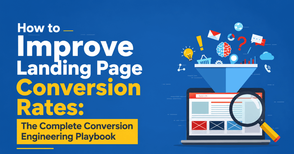
The fastest way to improve landing page conversion rates is to eliminate the gap between what your ad or link promises and what your landing page delivers — then systematically remove every friction point that stands between a visitor’s arrival and the action you want them to take. A page that converts at 2% and receives 1,000 monthly visitors generates 20 leads; optimized to 6%, that same traffic delivers 60 leads — tripling revenue from identical ad spend, with zero increase in budget.
This guide covers the complete conversion rate optimization (CRO) framework for landing pages: the psychology behind conversion decisions, the structural and design elements that win or lose the visitor in the first five seconds, the testing methodology that produces reliable results, and the specific tactics that consistently move conversion rates upward. Whether you manage landing pages in-house, work with a performance marketing agency in Chennai, or have built your pages with a website design company in Chennai, this is the definitive playbook for turning page traffic into business outcomes.
Why Landing Page Conversion Rate Is the Highest-Leverage Metric in Digital Marketing
Most marketing teams spend the majority of their optimization effort on traffic — better targeting, lower CPCs, higher Quality Scores. Very few give equivalent attention to what happens after the click. This is where the most significant performance gains are consistently available.
The data makes the case unambiguously:
- According to WordStream’s 2024 industry benchmark report, the average landing page conversion rate across all industries is 2.35%. The top 25% of advertisers convert at 5.31% or higher. The top 10% convert at 11.45% or above. That gap is not explained by ad quality or targeting — it’s explained by landing page quality.
- Unbounce’s 2024 Conversion Benchmark Report found that dedicated landing pages convert 65% better than sending paid traffic to a website homepage. Despite this, a significant proportion of PPC campaigns still direct traffic to generic pages.
- A Forrester Research study found that every $1 invested in CRO returns an average of $100 — a 9,900% return that no bid optimization or audience refinement approaches.
- Google’s own data shows that 53% of mobile users abandon a page that takes longer than 3 seconds to load — meaning page speed is a conversion problem, not merely a technical inconvenience.
- According to Aberdeen Group research, a 1-second delay in page load time reduces conversions by 7% — and this effect compounds with every additional second of delay.
The implication is straightforward: the same ad spend, the same audience, the same keyword targeting — pointed at a better landing page — generates significantly more revenue. A PPC agency in Chennai that manages campaigns at a professional level treats landing page optimization as a core campaign variable, not a peripheral concern.
The Psychology of Conversion: Why Visitors Do or Don’t Act
Before optimizing a single element, understanding why people convert — and why they don’t — provides the conceptual foundation for every tactical decision.
The 4 Psychological Drivers That Determine Conversion
Every purchase or lead-capture decision is governed by four internal forces. Your landing page must address all four:
| Driver | The Visitor’s Internal Question | Landing Page’s Job |
|---|---|---|
| Desire | “Do I actually want what this offers?” | Communicate the outcome, not just the product |
| Trust | “Can I believe this claim? Is this brand safe?” | Provide specific, verifiable proof |
| Urgency | “Why should I act now rather than later?” | Create genuine time, scarcity, or cost-of-inaction pressure |
| Clarity | “What exactly happens when I click this button?” | One unambiguous CTA with zero confusion about next steps |
When a landing page underperforms, it is almost always because one or more of these four drivers is absent or weak. The diagnostic question for any underperforming page is: which of these four is the weakest link?
The 5-Second Rule: First Impressions and Conversion
Research published in the journal Behaviour & Information Technology found that visitors form a first impression of a webpage in 50 milliseconds — and that impression is remarkably difficult to change. In the first 5 seconds, a visitor subconsciously answers three questions:
- Is this page relevant to what I was promised?
- Does it look professional and trustworthy?
- Is it immediately clear what I should do next?
If the answer to any of these is “no,” the visitor bounces — and the ad spend that brought them there is wasted. This is why above-the-fold design is not an aesthetic question; it is a conversion-critical business decision.
Element 1: Message Match — The Single Highest-Impact Improvement
Message match is the alignment between the language used in your ad, email, or organic result and the language used on your landing page. It is the most important single factor in landing page performance — and the most commonly neglected.
When a visitor clicks an ad promising “Free PPC Audit for Chennai Businesses” and arrives at a page headlined “Welcome to Our Digital Marketing Services,” the disconnect registers as a broken promise. The visitor’s brain interprets this mismatch as an indication that the landing page isn’t what they clicked for — and they leave.
According to Unbounce, improving message match alone increases conversion rates by an average of 212%. This is the highest single-factor conversion improvement documented in published CRO research.
The message match principle in practice:
If your Google Ad headline is: “3x Your ROAS With Expert PPC Management”
Your landing page headline should be: “Expert PPC Management That 3x’s Your ROAS — Starting This Month”
The vocabulary, the promise, the specificity — all must align. If you run multiple ads with different angles (benefit-focused, social-proof-focused, offer-focused), each should point to a landing page variant that matches that specific angle.
Message match is why a specialist digital marketing company in Chennai builds dedicated landing pages for each campaign rather than sending all ad traffic to a single generic page. One campaign → one message → one landing page → one CTA.
Element 2: The Headline — Where 80% of Conversion Is Determined
David Ogilvy’s foundational research established that 80% of readers read the headline but only 20% continue to the body copy. In digital contexts, this ratio may be even more extreme. Your headline is doing most of the conversion work — or failing to do it.
High-Converting Headline Formulas
| Formula | Structure | Example |
|---|---|---|
| Outcome + Timeframe | Get [result] in [time period] | “Double Your Qualified Leads in 60 Days” |
| Specific Benefit + Audience | [Benefit] for [specific audience] | “PPC Management Built for Chennai E-Commerce Brands” |
| Problem Solved | Stop [pain] with [solution] | “Stop Wasting Ad Budget — Get a Free Campaign Audit” |
| Number + Proof | [Number]-proven [outcome] | “The System That Reduced Our Clients’ CPL by 43%” |
| Social Proof + Offer | Trusted by [N] + [CTA] | “Trusted by 500+ Indian Brands — Get Your Free Strategy Call” |
| Question + Implied Answer | [Question that implies benefit] | “What If Your Google Ads Generated 3x More Leads?” |
What makes a headline convert:
- It speaks to one specific person, not a general audience
- It states an outcome, not a feature
- It creates enough curiosity or clarity to justify reading on
- It matches the intent of the traffic arriving on the page
What to test first: Headlines produce the largest conversion rate swings of any single element — routinely 20–50% differences between variants. Before testing anything else, test 3–4 headline formulas against each other.
Element 3: Above-the-Fold Design — The Conversion Architecture of the First Viewport
Everything visible without scrolling on a landing page is the “hero section” — the most conversion-critical real estate on the page. It must accomplish three things: confirm relevance (the visitor is in the right place), communicate value (why this offer is worth their time), and present the primary CTA (what to do next).The 4 Components of a High-Converting Hero Section
- The Headline — primary value proposition (covered above)
- The Subheadline — expands on the headline with specific, supporting detail
- The Hero Visual — outcome-focused image or video
- The Primary CTA — above the fold, always
- Visible without scrolling on 95%+ of devices
- High contrast against the surrounding design
- Action-oriented and benefit-framed (not “Submit” — but “Get My Free Audit”)
- One CTA only — competing CTAs create decision paralysis
CTA Copy: The Final Conversion Trigger
| Weak CTA (Generic) | Strong CTA (Benefit-Framed) |
|---|---|
| “Submit” | “Send My Free Campaign Review Request” |
| “Contact Us” | “Book a Free 30-Minute Strategy Call” |
| “Learn More” | “See How We Reduced CPL by 40%” |
| “Click Here” | “Claim Your Free Website Audit” |
| “Sign Up” | “Start My Free 14-Day Trial” |
| “Get Started” | “Get My Personalized Growth Plan” |
Element 4: Landing Page Copy — The Persuasion Architecture
Landing page copy has one job: move the visitor from awareness to action by systematically addressing their desire, building trust, creating urgency, and providing clarity. The copy structure should follow a proven persuasion sequence.
The PAS Framework for Landing Page Body Copy
PAS (Problem → Agitate → Solution) is the most reliable copywriting structure for conversion-focused landing pages:
Problem: Name the specific, painful reality the visitor experiences
“Most businesses running Google Ads in India are wasting 40–60% of their budget on clicks that will never convert into leads or sales.”
Agitate: Deepen the emotional cost of that problem
“Every day your campaigns run without expert optimization, you’re paying for irrelevant traffic, missing high-intent searches, and funding your competitors’ growth with your own budget.”
Solution: Present your offering as the obvious, logical resolution
“Weboin’s PPC management team audits your campaigns in week one, identifies the specific sources of waste, rebuilds your account architecture for maximum conversion efficiency, and delivers weekly performance reports — so you can see exactly what every rupee of spend is generating.”
Feature-to-Benefit Translation: The Copy Principle That Converts
Copy that lists features converts at a fraction of the rate of copy that translates those features into outcomes the visitor cares about.
| Feature Statement (Converts Poorly) | Benefit Translation (Converts Well) |
|---|---|
| “We use AI-powered bid optimization” | “Your bids adjust automatically to win high-value clicks without overpaying — 24/7, while you sleep” |
| “Dedicated account manager” | “One expert who knows your campaigns inside out — reachable by phone or email, never a support ticket” |
| “Weekly reports provided” | “Every Monday you see exactly where every rupee went and what it generated” |
| “Google Partner certified” | “Your campaigns are managed to Google’s highest performance standards — certified by the platform itself” |
| “15 years of combined experience” | “Your campaigns are built on patterns from hundreds of tested accounts — not trial and error on your budget” |
Objection Handling in Copy
Every visitor who doesn’t convert has at least one unresolved objection. High-converting landing pages identify the most common objections and address them proactively — before the visitor has to ask.
Common objections and copy responses:
- “This is too expensive” → Frame cost as investment: “Our clients average ₹4 in revenue for every ₹1 in management fees — within the first 90 days”
- “I’m locked into a contract” → Address directly: “Month-to-month. No lock-in. Our results keep clients — not contracts.”
- “I don’t know if this works for my industry” → Specificity: “We’ve delivered results for [list 4–6 industries]. If your industry isn’t listed, ask us — we’ll share comparable examples.”
- “I’ve been burned before” → Social proof: “93% of our clients renew after month 3. Here’s what they said about the experience.”
- “I don’t have time for onboarding” → Process clarity: “Onboarding takes one 45-minute call. After that, we handle everything.”
Element 5: Social Proof — The Conversion Multiplier
Social proof is the most powerful conversion lever on any landing page. According to Nielsen, 92% of consumers trust recommendations from other people — even strangers — more than brand communications. Social proof transfers the trust your past customers have earned to your future ones.
The Social Proof Placement Framework
| Social Proof Type | Conversion Impact | Best Placement |
|---|---|---|
| Client logos (recognized brands) | High | Hero section or immediately below |
| Star rating with review count | Very High | Hero section |
| Specific testimonials with results | Very High | Below hero, near secondary CTA |
| Video testimonials | Highest | Mid-page |
| Case studies with data | Very High | Mid-page before final CTA |
| Third-party badges (Clutch, G2, Google) | High | Near primary CTA and form |
| Customer count | Medium-High | Hero section |
| Press / media mentions | Medium | Below hero |
What Makes a Testimonial Convert vs. What Doesn’t
Weak testimonial (adds little conversion value):
“Great service! Very professional team. Highly recommend.” — Anonymous, Business Owner
Strong testimonial (is a conversion asset):
“Before Weboin took over our Google Ads, we were spending ₹2.5L/month and getting 18 leads. Within 60 days, we were getting 52 leads on the same budget. Cost per lead dropped from ₹13,888 to ₹4,807. We’ve now scaled to ₹6L/month with confidence in the results.” — Karthik R., Founder, Chennai-based real estate developer
The strong version includes: specific numbers before/after, a timeframe, the transformation in the client’s own words, and full attribution to a named, identified person.
Element 6: Page Speed — The Invisible Revenue Leak
For any business working with a website development company in Chennai to build landing pages, page speed is a non-negotiable business requirement — not a technical preference. The data on speed’s direct impact on conversion is the most consistent finding in all of digital marketing research.
- 53% of mobile users abandon pages taking over 3 seconds (Google)
- A 1-second delay reduces conversions by 7% (Aberdeen Group)
- Every 100ms of improvement increases conversion rates by 1% (Akamai)
- Pages meeting Core Web Vitals thresholds are 24% less likely to be abandoned before loading (Google)
Core Web Vitals: The Speed Framework for Landing Pages
| Metric | What It Measures | Good Target | Poor Threshold |
|---|---|---|---|
| LCP (Largest Contentful Paint) | When the main content loads | Under 2.5s | Over 4.0s |
| INP (Interaction to Next Paint) | Page responsiveness to input | Under 200ms | Over 500ms |
| CLS (Cumulative Layout Shift) | Visual stability during load | Under 0.1 | Over 0.25 |
Speed optimization priorities for landing pages:
- Image compression: Convert to WebP format; compress hero images below 150KB; use lazy loading for below-fold images
- Eliminate render-blocking resources: Defer non-critical JavaScript; async-load third-party scripts (chat widgets, analytics, social pixels)
- Use a CDN: Cloudflare (free tier), Fastly, or Amazon CloudFront deliver assets from servers geographically close to the visitor — critical for Indian audiences where many servers are internationally hosted
- Minimize redirects: Every redirect between ad destination URL and landing page adds 100–300ms of delay
- Host on managed servers: Shared hosting caps server response time (TTFB); managed WordPress hosting (WP Engine, Kinsta) or VPS hosting significantly improves performance
Diagnostic tools: Google PageSpeed Insights (free, with specific recommendations), GTmetrix, Lighthouse (built into Chrome DevTools), WebPageTest.
Element 7: Form Design — The Final Conversion Gate
The form is where conversion happens physically — it is the last step between intent and action. Even a visitor fully convinced by your copy and design can be lost to a poorly designed form.
Form Design Principles That Maximize Completion Rate
Field reduction: HubSpot’s research found that reducing form fields from 11 to 4 increased conversions by 120%. The rule: ask only for what you need to initiate a business conversation. Everything else can be collected through progressive profiling in subsequent interactions.
Minimum fields by business type:
| Business Type | Essential Fields | Optional Later |
|---|---|---|
| Service/agency (consultation) | Name + Phone or Email | Company, budget |
| Lead gen (free resource) | Email only | First name |
| Quote request | Name, Email, Project description | Timeline, budget |
| E-commerce checkout | Email, shipping, payment | Account creation |
| Demo booking | Name, Email, Company | Role, team size |
CTA button copy on the form: The button is not a button — it’s the final CTA. Apply the same benefit-framing principle:
- ✅ “Get My Free PPC Audit”
- ✅ “Send My Consultation Request”
- ✅ “Book My Free 30-Min Call”
- ❌ “Submit”
- ❌ “Send”
Trust signals adjacent to the form: Place these directly beside or below the form submit button:
- Privacy assurance: “We never share your information. Zero spam.”
- Response time: “We respond within 2 business hours”
- Social proof: “Join 500+ businesses who’ve taken this step”
- Security badge (for pages collecting payment information)
Multi-step forms for complex conversions: For forms requiring more than 4 fields, multi-step forms with a progress indicator (Step 1 of 3) consistently outperform single-page long forms — because the first step commits the visitor to the process, making subsequent steps feel like continuation rather than initiation.
Element 8: Trust Architecture — Design That Builds Credibility
Every element of a landing page either builds or erodes trust. Since 75% of users judge a brand’s credibility based on website design (Sweor, 2024), the visual quality and trust signaling of a landing page is a direct conversion variable — not merely an aesthetic preference.
The Trust Signal Checklist for Landing Pages
Visual professionalism:
- Consistent brand colors, typography, and spacing throughout
- Professional photography (real team/product photos — not generic stock images)
- Clean, uncluttered layout with strategic whitespace
Security signals:
- HTTPS (padlock in browser bar) — non-negotiable; HTTP pages trigger browser security warnings
- SSL certificate badge near form (where appropriate)
- Privacy policy link accessible from the page
Business legitimacy signals:
- Physical address and phone number visible
- Named team members with photos on the page or easily accessible
- About page or company information accessible via footer
Third-party validation:
- Review platform badges (Google Reviews, Clutch, G2, Trustpilot)
- Certifications and partnerships (Google Partner, Meta Business Partner)
- Industry associations and awards
- Media mentions (“As featured in Economic Times, YourStory”)
For landing pages built by a professional website design company in Chennai, these trust elements should be designed into the template architecture — not added as afterthoughts.
Element 9: CTA Strategy — Placement, Frequency, and Framing
The CTA is the conversion trigger — the exact moment where visitor intent becomes action. Most landing pages have one CTA. High-converting landing pages have multiple CTAs, strategically placed throughout the page to capture visitors who reach their decision point at different stages of reading.
CTA Placement Architecture for Long-Form Landing Pages
Position 1: Above the fold (hero section) For visitors who arrive with high intent and don’t need to be convinced — they just need to see the offer and act. Captures 5–15% of all conversions on most pages.
Position 2: After the first social proof block For visitors who needed to see evidence before acting. Captures visitors who were interested but skeptical.
Position 3: After objection handling / FAQ section For visitors who had specific concerns that needed addressing before committing.
Position 4: Page footer / final CTA section For visitors who read everything and are the most engaged — the highest-intent group on the page.
Research by Crazy Egg found that pages with 3–4 strategically placed CTAs convert at 1.5–2x the rate of pages with a single CTA — because different visitors reach their decision point at different scrolling depths.
CTA Button Design Principles
Color: The single most important property of a CTA button is contrast against its background. There is no universally “best” CTA color. The best color is whichever creates the most visual distinctiveness within your specific design system.
Size: Large enough to be immediately noticeable and easily tappable on mobile (minimum 44px height; 50–60px for primary CTAs). Small CTAs are missed; oversized CTAs look aggressive.
Shape: Rounded corners (8–12px border radius) consistently outperform sharp corners in A/B tests — they are perceived as less confrontational and more approachable.
Whitespace: Surround the primary CTA button with generous whitespace so it “breathes” visually and commands attention without competition from adjacent elements.
Element 10: Mobile Optimization — Designing for the Majority
Mobile devices account for 60–70% of all paid search traffic in India (Google India data, 2024). A landing page designed desktop-first and patched for mobile is, by definition, optimized for the minority of its traffic.
Mobile Landing Page Conversion Checklist
Layout:
- [ ] Single-column layout for all content — no horizontal scrolling
- [ ] Primary CTA visible above the fold on a 375px wide viewport
- [ ] All tap targets minimum 44x44px
- [ ] Form fields large enough to tap without zooming
Speed:
- [ ] LCP under 2.5 seconds on simulated 4G (test in Google PageSpeed Insights)
- [ ] Images served in WebP format and compressed for mobile screens
- [ ] Third-party scripts minimized or deferred
Forms:
- [ ] Appropriate keyboard type triggered (email keyboard for email fields, numeric for phone)
- [ ] Autocomplete enabled on all standard fields
- [ ] Submit button full-width or large enough to tap without precision
Trust signals:
- [ ] Phone number is click-to-call on mobile
- [ ] Form trust signals visible without scrolling past the form
- [ ] Security badge visible on pages with payment elements
Element 11: A/B Testing — The System That Compounds Gains Over Time
Individual optimizations improve conversion rates in isolation. A systematic A/B testing program compounds those improvements over months and years — each winning test becomes the new baseline against which the next test is measured.
Brands that run consistent A/B testing programs for 12+ months routinely achieve landing page conversion rates 3–5x their starting performance — not through any single dramatic change, but through the accumulation of dozens of small, validated improvements.
The A/B Testing Framework: From Hypothesis to Scale
Step 1: Prioritize with the PIE Framework Score every potential test on three dimensions (1–10 each) and test in order of highest total score:
- Potential: How much improvement could this realistically deliver?
- Importance: What proportion of conversions does this element affect?
- Ease: How technically straightforward is this change to implement?
Step 2: Write a testable hypothesis
“We believe that changing the CTA button copy from ‘Contact Us’ to ‘Book My Free Strategy Call’ will increase conversion rate by 15–25%, because the benefit-framed, specific CTA communicates clearer value than the generic contact framing, and we will know this worked when conversion rate improves by at least 10% with 95% statistical confidence.”
Step 3: Ensure statistical validity
- Minimum 100 conversions per variant before declaring a winner
- 95% statistical confidence threshold (use AB Testguide.com or Optimizely’s calculator)
- Minimum 7–14 day test duration to account for day-of-week traffic variation
- One variable changed per test — never multiple simultaneous changes
Step 4: Document and scale Winning variants become the new control. Losing variants generate hypotheses about why they failed — which informs the next test cycle.
A/B Testing Priority Order
| Priority | Element | Typical CVR Impact |
|---|---|---|
| 1 | Headline / value proposition | 20–50% |
| 2 | CTA copy and button design | 10–30% |
| 3 | Hero image or video | 10–25% |
| 4 | Offer structure | 15–40% |
| 5 | Form field count | 10–120% |
| 6 | Social proof type and placement | 5–20% |
| 7 | Page length (short vs. long-form) | 5–25% |
| 8 | Trust signal types | 5–15% |
A/B testing tools: VWO (Visual Website Optimizer), Optimizely, Unbounce (built-in testing for landing pages), Google Analytics 4 Experiments, Hotjar (qualitative insights for test hypothesis generation), Microsoft Clarity (free heatmaps and session recordings).
How Weboin Builds and Optimizes Landing Pages That Convert
At Weboin — a full-service digital marketing agency in Chennai offering both performance marketing and website development — landing page conversion is treated as an integrated discipline where design, copy, technical performance, and paid media strategy work together as a single system.
The Weboin Landing Page Conversion Process:
Phase 1 — Conversion Audit Before building or changing anything, we audit every active landing page against a 40-point checklist covering message match, hero architecture, copy quality, social proof effectiveness, form design, page speed, mobile experience, and trust signal completeness. Each audit produces a prioritized issue list ranked by expected conversion impact.
Phase 2 — Qualitative Research We install Hotjar or Microsoft Clarity to capture heatmaps, scroll maps, session recordings, and form analytics. This reveals where visitors are clicking, where they’re stopping, where they’re abandoning forms, and which elements are receiving attention vs. being ignored. Quantitative data tells us what is happening; qualitative tools tell us why.
Phase 3 — Hypothesis Development and Testing Roadmap Based on audit and qualitative research findings, we build a testing roadmap using PIE scoring. We typically identify 8–12 testable hypotheses per landing page, prioritized by expected conversion impact. The roadmap runs 90+ days, with each test cycle building on the learnings of the previous one.
Phase 4 — Design and Development Where new landing pages are required, our team at Weboin — functioning as both a website development company in Chennai and a performance marketing partner — builds pages that integrate conversion architecture, brand identity, technical performance standards, and A/B testing infrastructure from the ground up.
Phase 5 — Implementation, Testing, and Iteration Tests run until statistical significance at 95% confidence is confirmed. Winners become the new baseline. The cycle continues indefinitely — because landing page performance is never “done,” only “currently optimized.”
Typical client outcomes from a structured CRO program with Weboin:
- 30–80% conversion rate improvement within 90 days
- 25–50% reduction in cost per lead from identical ad spend
- Improved Google Ads Quality Score (better landing page experience = lower CPCs)
- Measurable reduction in bounce rate for paid traffic
The Complete Landing Page Pre-Launch Checklist
Use this checklist to quality-assess any landing page before publishing or scaling ad spend to it:
Message and Copy:
- [ ] Headline mirrors the ad or link source (message match confirmed)
- [ ] Headline states a benefit for a specific audience (not a generic welcome)
- [ ] Subheadline expands with specificity (how + what makes this different)
- [ ] Body copy leads with benefits, not features
- [ ] Top 3 objections are addressed explicitly
- [ ] Copy is in second person (“you,” “your”) throughout
Social Proof:
- [ ] At least one testimonial with specific, attributed results
- [ ] Client logos visible above the fold or immediately below hero
- [ ] Review count and star rating displayed
- [ ] Third-party badge (Clutch, Google, G2) near CTA
Design and UX:
- [ ] Primary CTA above the fold and visually distinct
- [ ] CTA copy is benefit-framed (not “Submit”)
- [ ] No navigation menu (for paid traffic landing pages)
- [ ] Single primary CTA per page (one objective only)
- [ ] Trust signals complete: HTTPS, privacy policy, contact info
Technical:
- [ ] LCP under 2.5 seconds (confirmed via PageSpeed Insights)
- [ ] Core Web Vitals pass on mobile
- [ ] Mobile layout tested on 375px viewport (iPhone SE size)
- [ ] All tap targets are minimum 44x44px
- [ ] Conversion tracking confirmed in GA4 and ad platform
- [ ] UTM parameters on destination URL for traffic attribution
Form:
- [ ] Field count at minimum required for business purpose
- [ ] CTA button copy is benefit-framed
- [ ] Privacy assurance adjacent to submit button
- [ ] Form tested on mobile — keyboard types correct, autocomplete works
Common Landing Page Mistakes That Destroy Conversion Rates
Mistake 1: Sending Paid Traffic to the Homepage Homepages serve multiple audiences with multiple objectives. Dedicated landing pages serve one audience with one objective. Unbounce’s research shows dedicated landing pages convert 65% better for paid traffic. Never use a homepage as a campaign destination.
Mistake 2: Message Mismatch Between Ad and Page The exact vocabulary of your ad must appear in your landing page headline. Any disconnect registers as a broken promise and triggers an immediate bounce.
Mistake 3: Multiple CTAs Competing for Attention Five different CTAs create decision paralysis. Hick’s Law states that the time to make a decision increases logarithmically with the number of options. One primary CTA. Supporting CTAs only for clearly different audience segments.
Mistake 4: Absent or Generic Social Proof “Great service, highly recommend” from “Anonymous” builds zero trust. Specific results with named, attributed sources build conversion-grade trust.
Mistake 5: Slow Page Speed Investing in design and ads but hosting on ₹150/month shared hosting is self-defeating. Speed is a revenue asset — host, compress, and optimize accordingly.
Mistake 6: Ignoring Mobile Experience With 60–70% of traffic arriving on mobile in India, a desktop-first landing page is optimized for the minority. Design mobile-first, then enhance for desktop.
Mistake 7: Testing Without Statistical Controls Ending A/B tests early when one variant appears to be winning, or changing multiple elements simultaneously, produces unreliable data that leads to wrong decisions. Statistical significance before any declaration of a winner — always.
Mistake 8: Not Connecting Landing Page to Ad Quality Score Google’s Quality Score for search ads includes “Landing page experience” as one of three components. A high-quality, fast, relevant landing page lowers your CPCs across all campaigns. A well-designed landing page from a quality website design company in Chennai isn’t just a conversion asset — it’s a cost-reduction lever for your entire paid search account.
A 90-Day Landing Page Optimization Roadmap
Days 1–30: Audit and Foundation
- Audit all active landing pages against the 40-point checklist above
- Install Hotjar or Microsoft Clarity on all pages
- Run Google PageSpeed Insights — fix all “Poor” Core Web Vitals
- Verify message match between top 5 ads and their destination pages
- Reduce form fields on all forms to minimum required
- Update all CTA button copy to benefit-framed language
- Confirm conversion tracking is firing correctly in GA4 and ad platforms
Days 31–60: Test and Optimize
- Run first A/B test: headline on highest-traffic landing page
- Review heatmap and session recording data — identify top 3 friction points
- Build and publish dedicated landing pages for top 3 traffic sources (if not existing)
- Test CTA button copy and color based on Principle 9 above
- Add specific, attributed testimonials with results to all service landing pages
- Implement click-to-call button on all mobile landing pages
Days 61–90: Scale and Compound
- Declare winner from A/B test 1; launch A/B test 2 (based on heatmap findings)
- Review 90-day conversion data: calculate CPL reduction vs. baseline
- Build landing page variants for next campaign launch (different angle for A/B)
- Implement FAQ schema markup on key landing pages
- Review mobile conversion rate vs. desktop: if gap exceeds 30%, prioritize mobile redesign
- Build Month 4 testing roadmap based on cumulative learnings
Frequently Asked Questions About Landing Page Conversion Optimization
The industry average is 2.35%; top performers convert at 5.31%+ and the top 10% achieve 11.45%+. Focus on improving your specific baseline rather than chasing industry benchmarks — every 1% absolute improvement in conversion rate directly reduces cost per lead.
Quick wins from headline and CTA copy changes are testable within 2–4 weeks. Sustained optimization programs building through multiple test cycles produce significant measurable improvement within 60–90 days. Full compound improvement over 6–12 months of systematic testing is where the most dramatic results appear.
Yes — dedicated landing pages per campaign, per offer, and per audience segment consistently outperform shared or generic pages. Message match between ad and page is the single highest-impact landing page variable, and it requires page-level specificity.
You need enough conversions per variant for statistical significance — typically 100 per variant at 95% confidence. If your current conversion rate is 2%, that's 5,000 visitors per variant. At lower traffic volumes, use CTR as a directional proxy but treat conclusions as hypothetical until conversion volume validates them.
A specialist website design company in Chennai and website development company in Chennai like Weboin that integrates CRO principles into design and development — not just aesthetics — delivers pages that perform commercially, not just visually. The key question to ask any agency: "Do you measure conversion rate post-launch, and do you include A/B testing infrastructure in the build?"
Google's Quality Score (1–10 per keyword) includes Landing Page Experience as one of three components. A high-quality, fast, relevant landing page improves Quality Score, which directly reduces CPC and improves ad position — meaning a better landing page makes your entire paid search campaign cheaper. For this reason, a PPC agency in Chennai that treats landing pages as outside its scope is leaving significant campaign efficiency gains unrealized.
Final Thought: Every Rupee of Ad Spend Lives or Dies on Your Landing Page
Every click represents an investment. Every page load is a moment where that investment either generates a return — a lead, a sale, a consultation — or produces a loss. The landing page is where that determination is made, not the ad.
The brands consistently generating the strongest performance marketing results are not necessarily running better ads. They’re sending better-targeted, better-aligned traffic to landing pages that have been systematically built and tested to convert.
A 1% improvement in landing page conversion rate from the same traffic volume can double the number of leads your business receives monthly. Sustained optimization — headline testing, social proof refinement, speed improvements, form simplification — compounds these gains over time into a structural performance advantage that competitors cannot quickly replicate.
Whether you’re optimizing independently, working with a specialist performance marketing agency in Chennai like Weboin, or partnering with a digital marketing agency in Chennai that integrates design, development, and conversion optimization — the framework in this guide is your complete blueprint for building landing pages that don’t just exist — they convert.
About Weboin: Weboin is a full-service digital marketing company in Chennai offering performance marketing, PPC management, website development, landing page design, SEO, and conversion rate optimization. As a trusted website design company in Chennai and performance marketing agency in Chennai, Weboin helps businesses build landing pages that convert paid traffic into qualified leads and measurable revenue — through data-driven design, expert copy, and systematic A/B testing.

No comment yet, add your voice below!